Go Big with Branding: Mars Food
When Mars Food moved its headquarters from California to Chicago to be closer to other Mars Global divisions, Latitude had the opportunity to design a new, dynamic work space for their employees.
Large Digital Graphics Solidify the Brand Image at Mars Food in Chicago.
When Mars Food moved its headquarters from California to Chicago to be closer to other Mars Global divisions, it had the opportunity to create a new, dynamic work space for its employees. The building was once an old Chicago factory that had been refurbished into a modern workspace. Mars Food furthered the design with a custom look for their conference rooms, kitchen, and work spaces. The interior designers worked with the team at Latitude Signage to design and build a complete signage package that reflected the brand and enhanced the building’s sophisticated loft style.
DIGITAL PRINT WALL GRAPHICS
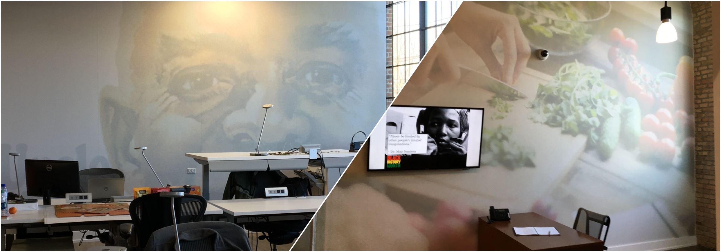
We worked collaboratively with Grafx Communication Group on design and wanted to use images that incorporate the Mars Food brands into the space and to identify specific conference rooms. In addition to plaque signs by conference doors, oversized printed wall graphics visually tell you what brand works in each conference room.
Large digital prints with product images are not exclusive to conference rooms. Uncle Ben’s is the most well-known brand in the Mars Food division and a large visual of the logo creates a dramatic backdrop to the main workspace of the office.
“Our installers did a phenomenal job placing these digital prints,” Dan says. “With an open concept loft-style building there are exposed pipes and ductwork near the ceiling that you have to work around. It can be a very difficult installation, but the results are incredible.”
SOPHISTICATED STYLE
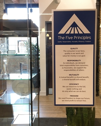
Before walking in the door, guests and employees see “The Five Principles” that make it very clear what this company is about. They are Quality, Responsibility, Mutuality, Efficiency, and Freedom.
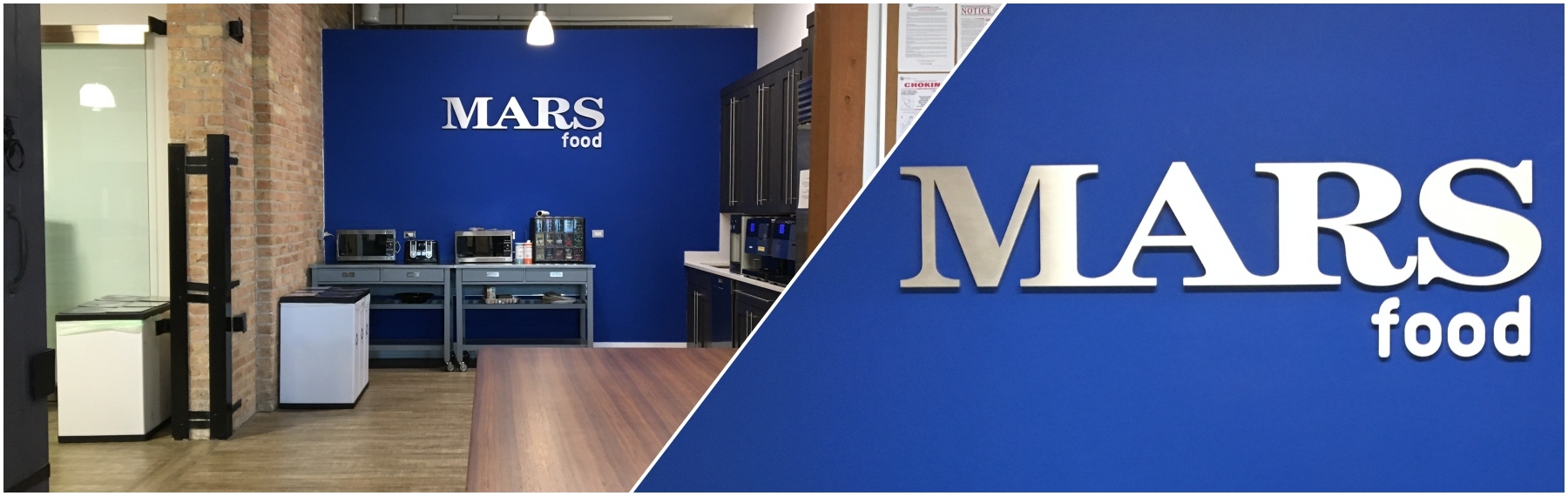
Behind the main reception area guests are immediately greeted with a chic blue wall with the Mars Food logo in ½‑inch thick brushed aluminum. This bold pop of color and minimalist wall detail punctuates the modern style of the building and delivers the brand identity to everyone who walks through the door.
While Mars Food is now part of the larger corporate campus within the River North area of Chicago, it has its own distinct look and feel. The signage and digital print wall graphics embody the brand and establish a creative working environment.
Liked this? Want more inspiration? See what other companies are doing for their corporate signage projects here.
And sign up to get inspiration delivered to your inbox on a monthly basis, no spam, no silliness.
Like what you see?
Get more ideas, design, and inspiration delivered to your inbox on a monthly basis. Sign up for our email, we won’t waste your time!