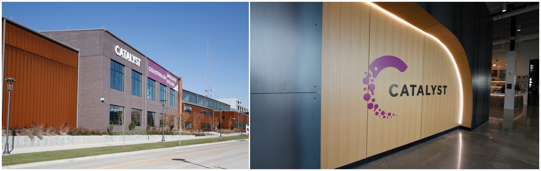
Design-Build Signage Brings Cohesion and Sophistication to Mixed-Use Coworking Space at Catalyst
This 170,000-square-foot office, event, and community space and its amenities required a cohesive signage system that would feel modern, adaptable, and elevated, supporting both the building’s architecture and evolving tenant needs.
Catalyst Omaha, once Omaha Steel Works, has been transformed into a modern coworking and office space designed to inspire and elevate productivity. With 170,000 square feet of office, event, and community space and amenities, the project required a cohesive signage system that would feel modern, adaptable, and elevated, supporting the building’s architecture and evolving tenant needs.
Project Overview
The Catalyst project was a comprehensive design-build signage collaboration developed in partnership with two real estate developers, Koelbel and Company and GreenSlate Development, whose goal was to transform the former Omaha Steel Works factory into an ecosystem for innovation and entrepreneurship.
Catalyst called for a signage program that balanced simplicity with sophistication. The team needed to design signage that was visually refined, highly customizable, and adaptable to seasonal and community-driven events without overwhelming the building’s clean architectural language.
The Approach
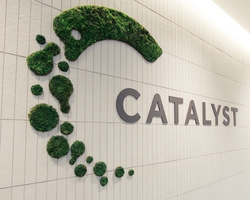
The signage team collaborated closely with designer Anna Bogler, who served both as the project designer and the owner’s representative. This streamlined communication and allowed for quick decision-making while maintaining design integrity throughout the process.
The strategy focused on:
Clean forms and restrained materials
Thoughtful lighting integration
Modular signage systems that could accommodate change
The Challenge
Flexibility was key, as the building’s branding evolved throughout the project. With frequent updates to iconography and other branding elements, the client needed a system that could shift without constant redesign or fabrication.
The team designed with adaptability in mind, ensuring icons could be swapped or revised without disrupting the overall system or aesthetic. This approach empowered the client while allowing developers to maintain a polished, cohesive look throughout the building.
Exterior Signage
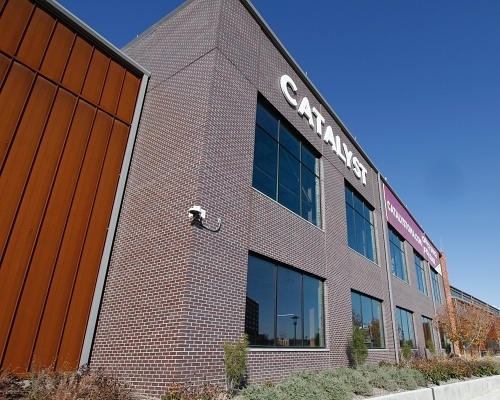
The exterior signage became a defining feature of the building. RGB-illuminated letters allow the building sign to change color for special occasions and awareness campaigns like Breast Cancer Awareness Month. The dynamic lighting adds personality and community engagement while keeping the core design simple and timeless.
The exterior letters were fabricated with high-quality craftsmanship that ensured clarity, durability, and visual impact both day and night.
Interior Signage
The interior signage system was designed to feel light, modern, and intentionally understated while offering moments of visual interest through material detail and lighting.
Key elements included:
Clear acrylic backers, intentionally undersized with polished edges. When ambient light hits the edges, the signs appear to glow, creating a subtle but striking effect.
A digitally printed wood-grain sign, delivering the warmth and texture of wood while maintaining consistency and durability.
A clean, legible elevator directory that anchors wayfinding within the building.
Sleek T‑bracket-mounted signs are used throughout the building, reinforcing a consistent visual language across shared spaces.
The Results
The Catalyst signage program delivers a refined balance of simplicity, flexibility, and visual impact. Exterior elements engage the community through dynamic lighting, while interior signage enhances navigation and atmosphere through thoughtful detailing and material choices.
The result is a cohesive, future-ready signage system that reflects strong collaboration, careful craftsmanship, and a shared commitment to design excellence.
Have questions about this project?
Reach out to us at connect@latitudesignage.com.
Explore more mixed-use building projects:
Like what you see?
Get more ideas, design, and inspiration delivered to your inbox on a monthly basis. Sign up for our email, we won’t waste your time!