The Show Must Go On: Collaborating on Signage for Riverside Theatre in Iowa City, Iowa
Neumann Monson, Riverside Theatre, and Latitude come together to create a seamlessly updated look, with a nod to the Art Deco origin, at this property on Iowa City’s popular Pedestrian Mall.
It was just a few months until the curtains would open on the new Riverside Theatre in Iowa City when the non-profit group reached out to our team. They needed help planning and designing signage to create an amazing patron experience for their historical theatre renovation.
“We’d never worked with a signage company before, and partnered with Latitude rather late in the process with only about six to ten months before we welcomed our first audience in. We knew we needed help, and we needed someone to guide us. They were able to take our ideas and put them into a cohesive plan” says Adam Knight, Producing Artistic Director at Riverside Theatre. “Working with Bryce and the Latitude team has been a great experience.”
Creating An Experience
“I don’t want the experience of the Riverside Theatre to start when the lights go down in the theatre,” Knight says. “I want it to start from the moment you see the façade on the sidewalk and you say, ‘oh, there’s a theatre there.’ And then you walk in and you see posters, and you see the signage leading you up to the stairs or to the elevator. It’s all part of the experience.”
Exterior Architectural Signage
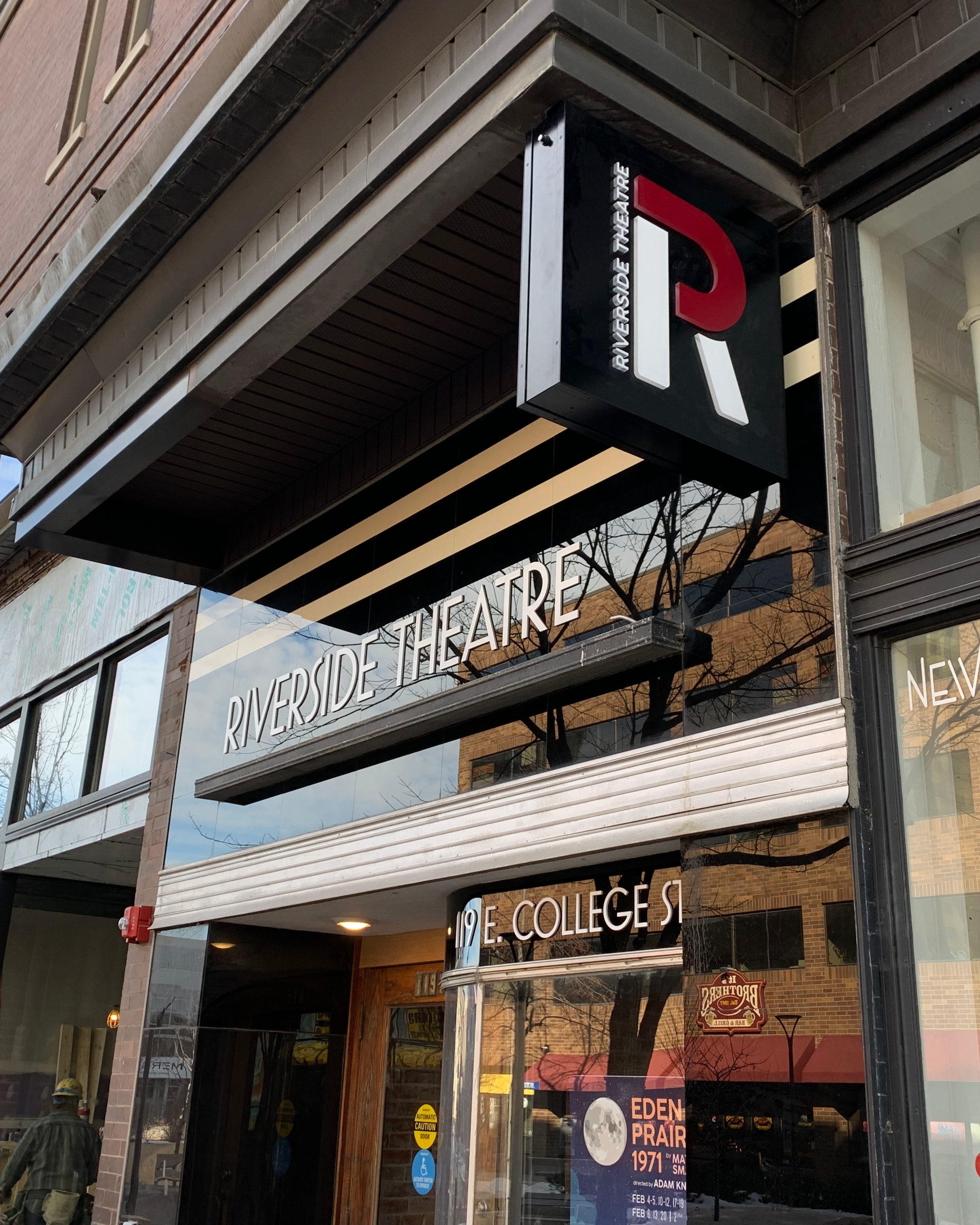
The first thing theatre-goers will notice when they arrive for a show is the new illuminated flag-mounted exterior signage installed under the awning. “The exterior sign had to meet a lot of requirements,” says Bryce Carlson, Latitude Business Development Manager. “We met with a historical preservations review board to make sure it fit with the city’s standards and didn’t damage the awning of this historical building during installation.”
There are also glass-mounted letters with up-lighting and vinyl letters along the front entrance of the theatre. “Signage out front was one of the first conversations we had,” Knight says. “This is a beautiful Art Deco building. It had a long life before us. It was a Montgomery Ward storefront. It was a beloved local business. I always loved this kind of Art Deco look. It’s this shiny glass, it’s this curved glass façade, and we wanted to preserve that. A lot of our patrons love that we’re honoring the history of the building with that awning.”
The team’s collaborative design and project management process made sure the illuminated aluminum sign with acrylic push-through letters and front-facing letters were well-received by the team at the theatre and with the community leaders. “We’re happy to have something that everyone can be proud of and know that it will stand the test of time,” Carlson says.
Art Deco Interior Architectural Signage
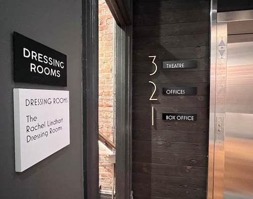
Inside the three-story theatre, building is a lobby on the first floor, offices on the second floor, and a black box theatre with a bar area on the third floor. With guests having to move throughout the building, wayfinding signage was important.
“Signage is a way for the Riverside Theatre to communicate with their patrons,” says Parker Dobberstein, Architect from Neumann Monson Architects. “It lets them know where the bathrooms are and what floor they are on. For this project, signage was critical primarily for wayfinding, but also to convey our original design concept to the very end to the finishing touches on the space.”
On this project, all the interior architectural signage is on ½‑inch thick acrylic, which is a little thicker than typical for interior room identifiers and ADA signage. Intentionally making the signs a little thicker gives them more visual weight and helps them stand out against a bustling crowd looking for the stairs or the elevator. The design of the interior signage also speaks to the hip yet historical feel of the theatre. “The fonts and pictograms are slim and reflect the overall style of the theatre,” says Carlson. “Details, like the design of the bathroom signs, matter and were handled with as much care as the showcase signage.”
Non-Profit Theatre Donor Wall Signage
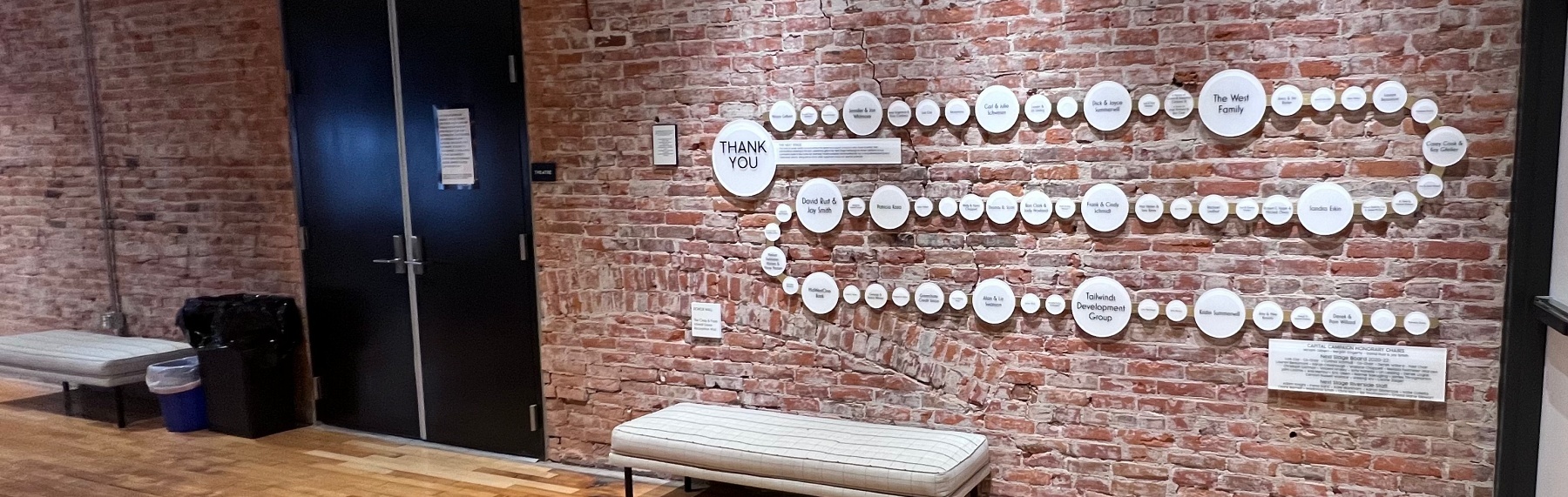
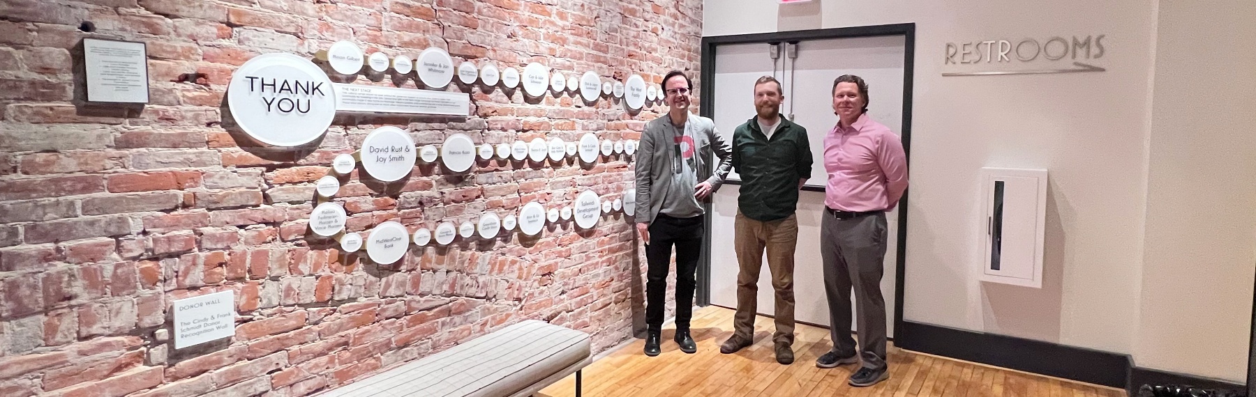
On the third floor is where patrons will see their names featured on a one-of-a-kind donor recognition wall. “As a non-profit theatre, we rely heavily on donations,” says Knight. “One of the things we wanted to do with the donor wall is to recognize those key stakeholders who donated $5,000 or more to the capital campaign. It’s the first thing you see when you exit that elevator. It’s attached to this awesome one-hundred-plus-year-old brick wall, and it not only honors those donors in a meaningful way, it also honors the staff, who are part of this project, and the board. They made this dream become a reality.”
Designing the donor recognition wall was a challenge. It took an innovative product solution to accommodate the number of donors and to display it well on the historical walls. “The original plan was too small to accommodate the many generous donors. But that’s a good problem to have,” Carlson says. “We moved it to a bigger wall near the elevators so everyone can see it when they arrive on the third floor. The circle design was inspired by the globe lights used throughout the building. But we didn’t want to drill into a 100-year-old wall any more than we had to. So we came with this foundation piece, a brass channel that’s attached securely to the wall, and then all the donor circles are attached to the brass channel. This gives the design flexibility and room to grow without having to make changes to the wall itself.”
Enhancing Experiences: Custom Specialty Signage
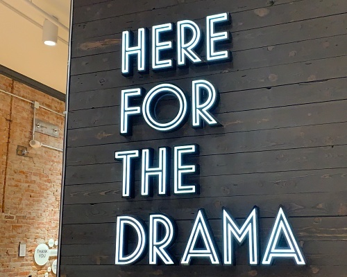
Before guests see the spotlight hit the stage, they will walk by a custom showpiece sign in the lobby bar. Originally they wanted a neon sign that read, “Here for the drama.” In keeping with the 1930s-inspired fonts used throughout the building, These fabricated letters are routed with a push-through acrylic that is illuminated with LED lights. It has the look and feel of a neon sign with crisp angles that suit the design of the theatre.
Another special sign was the elevator sign. Created with fluted glass, this new sign instantly adds a vintage vibe to the theatre. “It’s modern and retro all at the same time,” Carlson says.
“It feels very urban, and with the exposed brick and brass fixtures of the building, it feels like you could be in a historical New York theatre.”
“Cooperative working relationships where we talk through design ideas, trouble-shoot installation concerns, and manage all the details of a design-build project is key. Best thing about this project was that the team collaborated, and we were all on the same page with the vision,” Carlson says. “We took the look they were hoping for and ran with it. Having a focused design approach helped us execute the program in a short time window.”
“As an architect, there are so many things we’re dealing with,” Parker Dobberstein says. “Having someone like Latitude, who can take the signage and run with it is ideal. We can just hand that whole portion over to them and trust that they will get it done, it’ll look very nice, and be within budget. We had deadlines to meet on this project and Latitude really helped keep us running, keeping the client engaged in their designs, reviewing with them, and reviewing with us. We really trusted them to handle that whole package and it really turned out great.”
Want to learn and see more theatre signage? The 3 B’s to Theatre Signage
Have questions on this project? Contact Bryce Carlson
Not sure where to turn? Find your expert here
Like what you see?
Get more ideas, design, and inspiration delivered to your inbox on a monthly basis. Sign up for our email, we won’t waste your time!