Signage For A Work Of Art: Krause Gateway Center
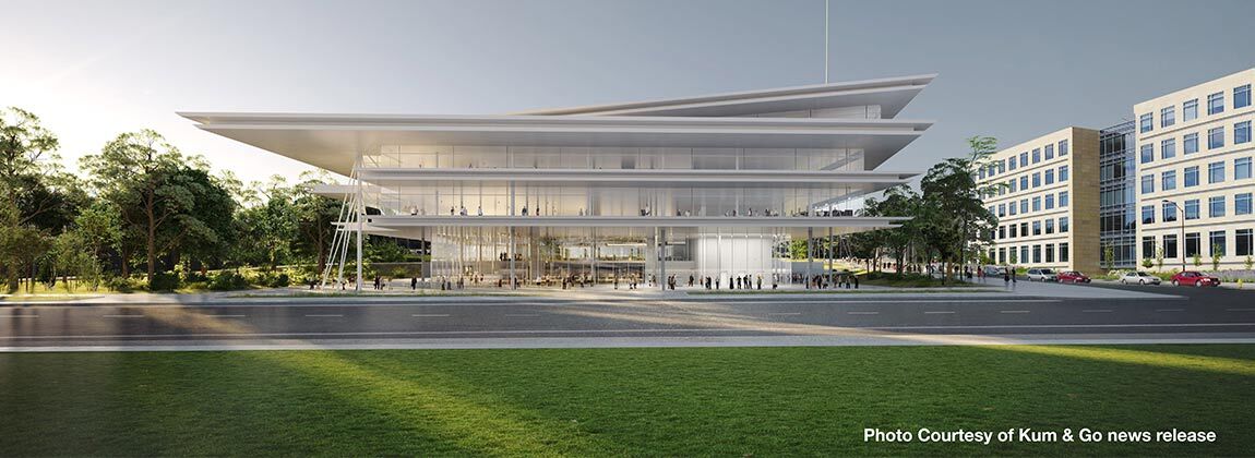
Steps from the Pappajohn Sculpture Garden in downtown Des Moines is a new building that’s sure to be an iconic piece of Iowa architecture: the Krause Gateway Center. Latitude partnered with Ryan Companies for the signage portion of this project.
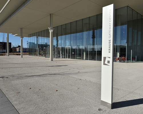
Steps from the Pappajohn Sculpture Garden in downtown Des Moines is a new building that’s sure to be an iconic piece of Iowa architecture: the Krause Gateway Center. Designed by Italian architect Renzo Piano Building Workshop with OPN Architects, this stunning building with soaring glass panel walls houses the corporate offices of Kum & Go and other Krause Group businesses.
“While some saw this as a construction project for an office building, it’s truly a work of art,” says Tony Squire, Business Development Manager for Latitude. “The design and execution of every element within the building is stunning. Set alongside the backdrop of the sculpture park, the Krause Gateway Center is a piece of modern art.” Tony and the Latitude team partnered with Des Moines-based Ryan Companies for the signage portion of this project.
The Kuhlmann Leavitt, Inc. sign package for the Krause Gateway Center had the goal of blending seamlessly with the building’s minimalist design. While creating discreet signage may sound simple, it was an incredibly complex task that required countless samples to make sure the Latitude team got everything exactly on target.
Latitude Signage executed the signage package flawlessly. Their team was committed to ensuring both the owner and architect were happy and their team worked very hard to meet the extremely critical schedule dates. Latitude Signage was an excellent teammate on this project and their signage was the jewelry on this beautiful building.
Signage Dedicated to the Details
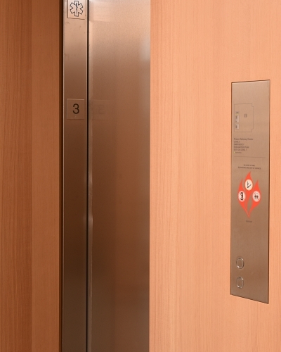
One example of the team’s precise eye for details was with elevator signage. Stainless steel on the elevator shaft has a vertical grain, so Latitude had to source a stainless-steel product that perfectly replicated the look. The solution was to use one vendor who could produce the desired vertical brushed pattern, and another vendor who could place the ADA required Braille elements, and finally the Latitude production team added the tactile graphics at the Grinnell facilities. The results are so flawless the average person using the elevator will never notice the hard work that went into crafting the seamless design. Mission accomplished.
Signage was so important on this project. Our client, needed everything to blend in with its surroundings. So everything had to match and fit precisely and also function without drawing any unnecessary attention to the sign.
Sourcing Greek Douglas Fir for Signage
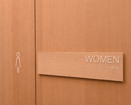
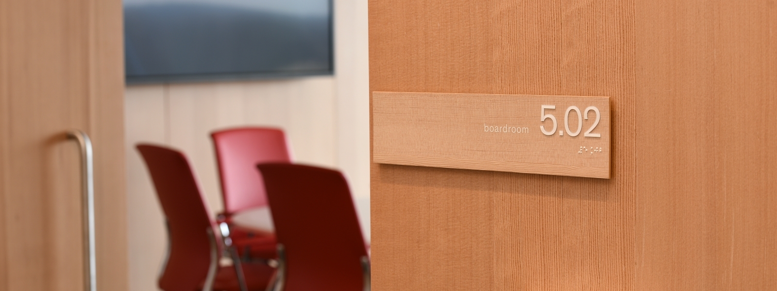
A very unique aspect of this project was to craft wood-look signs that matched some of the walls in the building. Both used the same product, a douglas fir veneer and varnish, imported from Greece.
“The veneer is very delicate,” says Durr. “Luckily our production manager is a connoisseur of wood products and knew how to store and handle the product to ensure that there was no opportunity for light damage.”
Going the extra mile to secure this wood product gives the directional signage throughout Krause Gateway Center the same rich feel as the distinctive wood walls.
No Detail Too Small
From color matching acrylic signs to mimic interior paint colors, concrete, and metal beams to the installation of parking signs, there was no element overlooked. Even in the underground parking garage, Latitude perfected the specifications for signage.
“The overhead signs in the parking garage required precise measurements,” says Ashley LaRue, Production Designer. “With angled ceilings and varying heights, it was crucial to triple check the length of each ceiling-mounted post so that all signs could be installed with proper clearance. It was a matrix of details to produce and install signs that seem so straight forward.”
Above ground, vinyl signs on glass walls and doors are another game changer. In a building with primarily glass walls and doors, adding distraction dots and push/pull signs were essential for a bustling workplace. Again, precision was key. Latitude worked with the interior designer to perfect the level of opacity for the distraction strips, which were designed as circles exactly 4‑inches apart on center.
Perfecting these functional elements supports the consistency seen throughout the minimalist style of Krause Gateway Center. “If you walk around the building with a discerning eye, you notice nothing is out of place,” Durr says. “You can feel the precision in the space. And that is no accident.”
Beauty of Simplicity
“We’re extremely proud of this project,” Durr says. “It’s as close to perfect as it can be, and everyone on our team made that possible. The signs may look simple, and walking by you’d never know how complex it was to have signs blend in so seamlessly. And that’s the beauty of it.”
Like what you see?
Get more ideas, design, and inspiration delivered to your inbox on a monthly basis. Sign up for our email, we won’t waste your time!