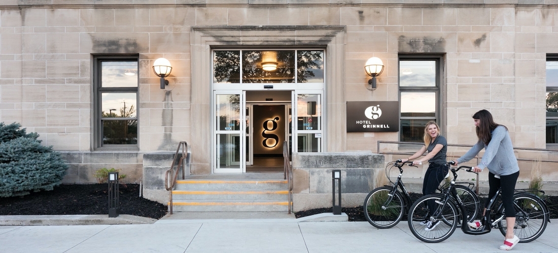
A Lesson in Boutique Hotel Signage: How signage helped put Hotel Grinnell on the map
Boutique hotel signage is the cherry on top of a beautiful sundae. With a higher, more architectural, design this type of signage most often reflects the character of the project. In this historical renovation, a school from 1921 in the heart of Grinnell, Iowa gets rejuvenated into a boutique hotel with thoughtful nods to its educational beginnings.
A typical hotel chain stay doesn’t make for much of an experience. From the décor to the amenities to the dining — it takes a special ambiance to make it memorable. But boutique hotels often deliver the charm that tips the scales.
Hotel Grinnell offers a unique combination of ‘old-school’ charm and new-school design. From 1921 to 1978, the building was home to a junior high and high school and later became the City Offices and Community Center. Angela Harrington, former President of the Grinnell Chamber of Commerce and Grinnell Visitors and Convention Bureau, had the creative foresight to transform the old school into a chic boutique hotel that would also serve as a community event center and destination location in Grinnell, Iowa.
But getting to this point? That was a process – one that involved both interior and exterior signage.
Getting Schooled With Signage
When Latitude got involved with the project in 2017, they learned Hotel Grinnell developers wanted signs that fit the theme and interior of the building — a far cry from your basic hotel signage. The signage needed to pay homage to the building’s history. From the furniture crafted from old lockers to the ballroom floor mimicking a basketball court, to chalkboards in the guest rooms…every detail was about creating a one-of-a-kind experience for guests.
Following the Rules of Hotel Signage
One of the major considerations is ADA compliant hotel signage. ADA accessibility can be especially tricky in historic renovation projects, but Hotel Grinnell leaned on the ADA expertise of Kristin Adkins, one of our ADA experts. Kristen, experienced in ADA-compliant signage for many hotel projects like Historic Park Inn and Element Hotel, works closely with ADA Guidelines to avoid risk and improve accessibility for hotel guests. More importantly, Kristin was able to match style with code to create a cohesive look.
To keep within branding standards, the signs needed to give a nod to the schoolhouse theme but deliver impact in an upscale way. An industrial look of simple, clean lines were representative of the town’s historical roots. The color palette? Understated and modern. Incorporating varying elements of the design, the end product complimented the distinctive interior.
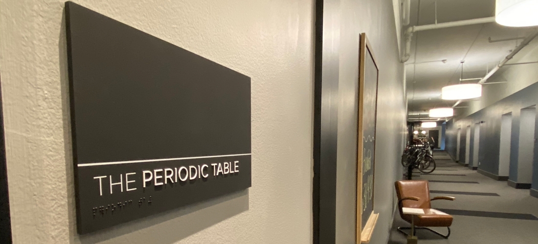
“It was a critical consideration to have the mounted signage within the parameters of historical renovations, such as no modifications to the building façade and without moving fixtures and light sconces, for example,” says Ben Latimer, the Director of Digital Media
“The biggest obstacle we faced was probably in the wayfinding signs,” says Kristin Adkins, DesignBuild Specialist. “The sign design was meant to wrap the corner, indicating the direction traffic is moving. Each sign location had to be verified to confirm placement and therefore, the bend of the signs and direction of arrows for each message had to be accurate. Also, each line of directional text is its own individual sign panel – panels were stacked to create multi-lines sign messages. This sign design, particularly the way they were installed, required extra thought and design work to allow for an even, accurate installation on site.”
Why Does Design-Build Experience Matter?
This was a true design-build signage project, which is nothing new to our team, that delivers an all-encompassing solution to the client. When design teams were brought on board, they first walked the space and developed a design plan that would incorporate the black and white, playing off the idea of a slate chalkboard. Our sign team was given a design presentation document that showed overarching themes and inspiration for hotel interior design looks and feels.
Once the concept was firmly in place, the design was collaboratively tweaked and production drawings were created for final approval before deciding on sign placement. From there, it was on to fabrication and finally, installation — overall, a turnkey process for a client.
The Details of Hotel Signage
Latitude was fantastic to work with from startwith start to finish. When I envisioned a giant "g" on the building they went to work and figured it out. Their creative team worked with our brand style and put together an interior and exterior signage package that was perfect as well.
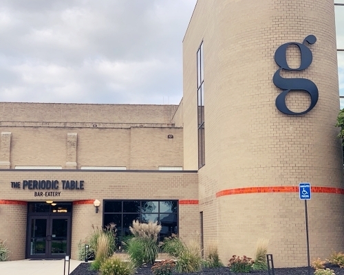
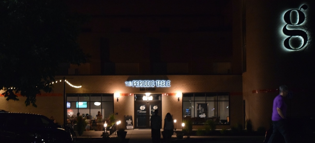
Guests of the hotel can see the team’s handiwork in the main identification sign, which is a large dimensional “G” on the south side of the building, a stairwell pillar sign and illuminated signage at the outside entrance to the bar and eatery, The Periodic Table. Far better than cafeteria food and stocked with various Iowa breweries, The Periodic Table hosts guests and the public alike — complete with artwork that spoke to the theme, the goal was to create signage that would mesh well with that.
All interior signs were made from ¼ inch thick acrylic with surface paint and graphics. The signs have a painted edge detail, meaning the color is different from the sign face, which creates a unique, custom look. Given the “corner wrap” of the wayfinding signs, they were constructed with welded aluminum panels to create a sharp “L” to bend around the building corners. Bent acrylic would not have created an accurate enough curve for a tight, consistent fit when installed. The horizontal white lines, especially noticeable on the wayfinding signs, are representative of the lined notebook paper children learned to write their ABCs on.
What is it Like Creating Signage for an Award Winning Hotel?
Having had the privilege of working with other businesses on signage through Chamber connections, it was an honor to be a part of this addition to the City of Grinnell. Harrington, Hotel Grinnell owner and operator, reached out personally to retain Latitude’s services.
A skilled team of eight to ten, including Ben Latimer and Kristin Adkins, the project manager, installers, as well as electrical contractors brought Harrington’s visions to life.
Creating signage was just a small part of the overall project, yet adds to the finishing touches that elevate the hotel from average to exceptional. I always feel honored when I hear talk about the hotel and how amazing it is.
What was the Final Grade?
This project honored history while giving the people of Grinnell and visitors something new to love. Hotel Grinnell has won many awards, including the 2018 Preservation at its Best Award, Best Hospitality 2018 and the 2018 Economic Impact Award, among others.
Their creative team worked with our brand style and put together an interior and exterior signage package that was perfect as well. I am using them again in my second hotel this time in Iowa City. I wouldn't use anyone else. They appreciate budgets and timelines - always on time and within budget.
Like what you see?
Get more ideas, design, and inspiration delivered to your inbox on a monthly basis. Sign up for our email, we won’t waste your time!