Let’s Go Fly a Kite — Healthcare Signage for Healing Children
Playful donor designs and thoughtfully designed signage brings a touch of whimsy to OSF HealthCare Children’s Hospital of Illinois, a transitional care facility for children.
Playful donor designs and thoughtfully designed signage brings a touch of whimsy to a transitional care facility for children.
Almost Home Kids in Peoria, Illinois, provides transitional care in a home-like setting for children with complex medical needs. OSF HealthCare Children’s Hospital of Illinois provides care for patients and training and respite care for families at Almost Home Kids, a 12-bedroom, 21,000 square foot home that is funded entirely by community donations. Honoring those donors was an important part of the building’s interior design.
Donor Wall Delights
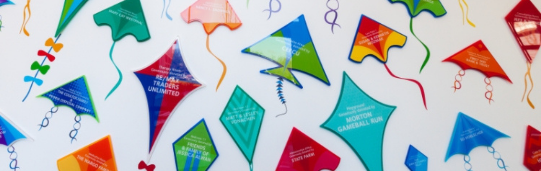
The creative challenge for Almost Home Kids’ donor wall was to design something visually enchanting for the patients that also honored the generous gifts that made the facility possible.
Latitude designer Andrej Steinberg’s kites are the perfect solution. The color palette and varied kite shapes infuse the facility with delightful dose of whimsy. While the display wall may seem like a random assortment of vibrant kites, there is nothing random about the design. Each layered acrylic kite with a vinyl tail is unique, giving each donor a distinctive designation. The kite shape and size also designate a level of giving.
I began to envision children playing and how important a sense of freedom is. The idea was to create imagery that was colorful and playful thus appealing to that sense of freedom. And what is more free-flowing and playful than a kite floating on the wind? The individual donor kites also created the opportunity to use multiple color palettes using bright primary colors. The layering of materials and mounting the kites at varying depths added to the appeal of the design.
Animal Adventures
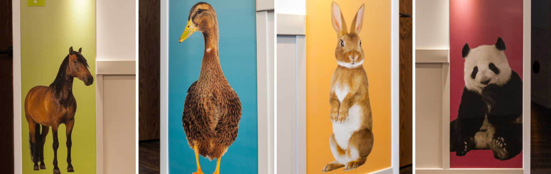
Beyond the donor wall Latitude crafted signs to make the children at Almost Home Kids feel at ease. Outside each patient room is a large digital print of an animal. This print is overlaid on a dry erase surface and finished with a special coating making the entire column dry-erase friendly. This playful solution gives caregivers a special place to leave notes welcoming new patients, and makes clean up a breeze if little ones have too much fun with a marker.
“The large dry-erase animal-themed room boards were kept clean and simple. Docile, friendly and cute creatures were chosen to encourage each patient to feel a sense of ownership of the room and for that matter, the animal. The animals were also meant to give a sense of calmness and were placed near the bottom of the boards to bring them down to the children’s level. The gradient backgrounds also pulled from AHK’s interior color palette.” — Andrej Steinberg, Environmental Graphic Designer, Latitude Signage.
Bring It Home
Even the humblest room identifier signs were carefully designed. Room IDs are house-shaped and mimic the shape of the building’s façade. A horizontal pattern in the acrylic creates the appearance of siding, furthering the house-like look.
The ADA room signage, with tactile copy and braille, was a no brainer. The exterior design of the marvelous facility just screamed “home.” So incorporating the architecture’s aesthetic into the room signage reinforced that feeling of being home. So the lap siding and round windows with the home shaped silhouette were incorporated into the design. The look was made more dynamic by pulling from AHK’s bright interior paint colors to make the signs in an array of colors.
Without feeling as institutional as a hospital, Almost Homes Kids cares for children with complex medical issues in a more comfortable setting. Being able to bring a little color and playfulness into the facility was an honor for Latitude’s creative and production design teams.
Like what you see?
Get more ideas, design, and inspiration delivered to your inbox on a monthly basis. Sign up for our email, we won’t waste your time!