Experiential Donor Recognition Wall Brought To Life With Bubbles, Gumballs, and Grass at Beatrice Public Schools
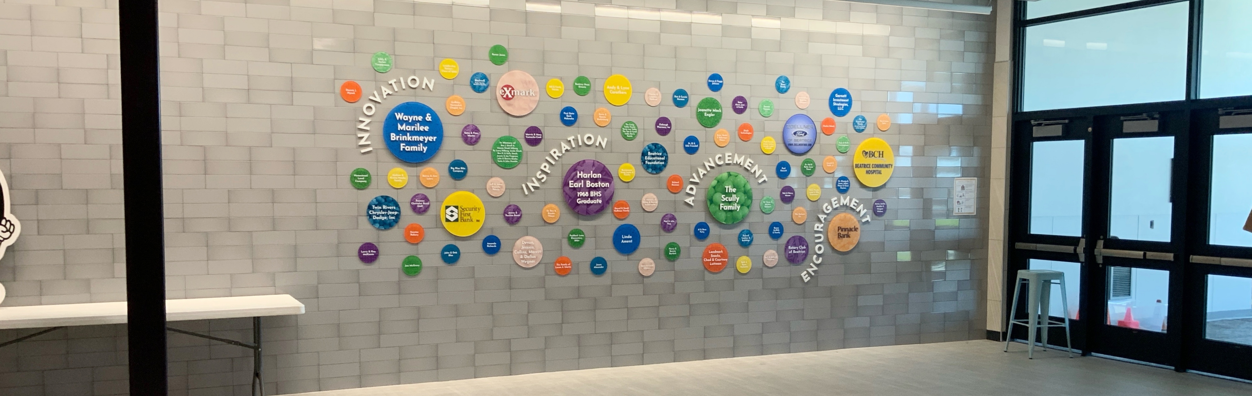
Beatrice Public Schools, located in Beatrice, Nebraska, was looking for a donor recognition display that would adequately honor the individuals, families, and organizations that support the school district’s mission to be among the best in the nation. Through our Design-Build process, we collaborated with the district team to create a unique, visually dynamic donor recognition display that draws adults’ attention and gives kids something fun and colorful to look at throughout their school day.
The Challenge:
Merging Architecture with Donor Recognition
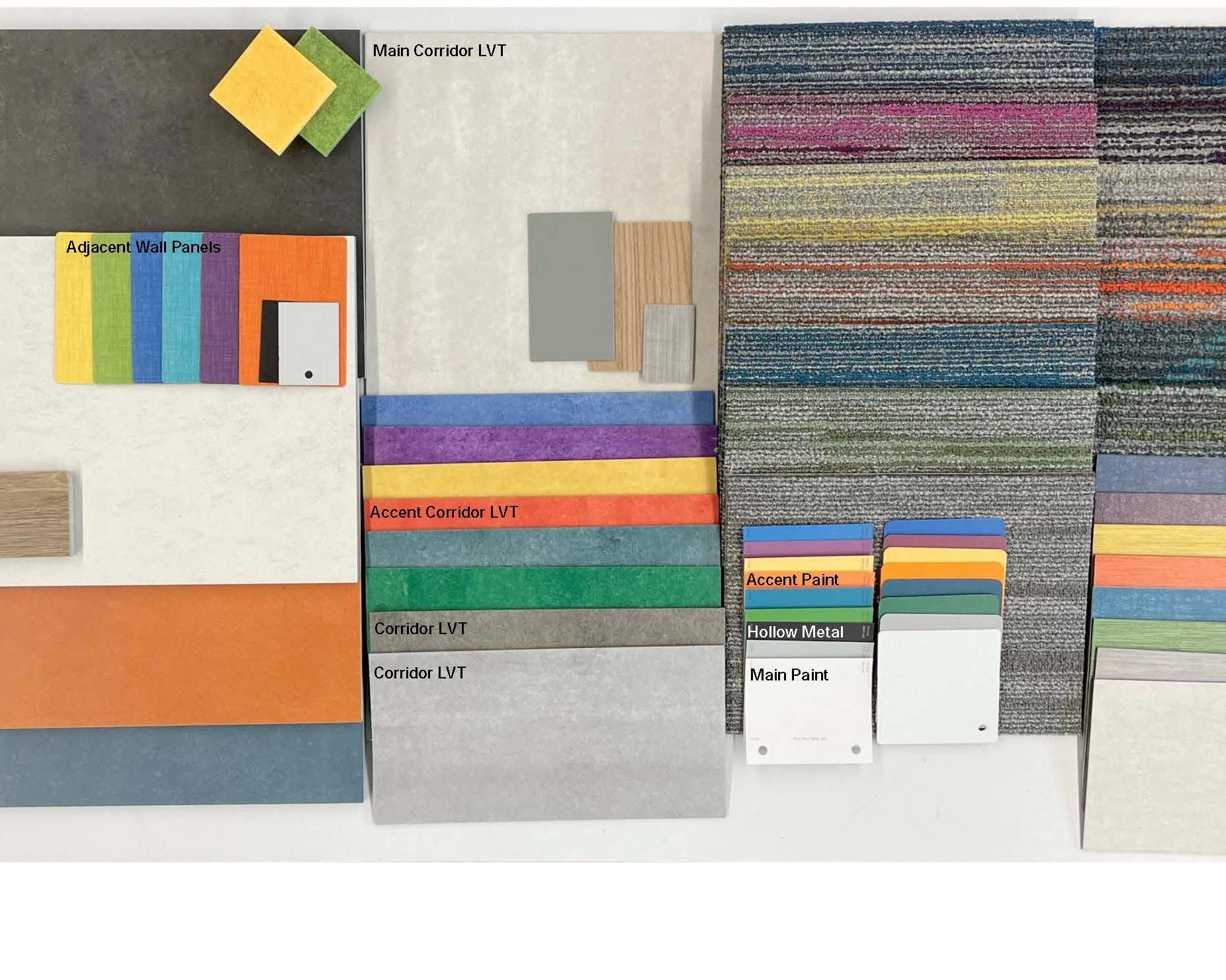
The district granted Latitude creative freedom, providing building elevations, a finish schedule, and an interior color board. The primary challenge was twofold:
- Integrate the campaign’s four localized tiers of giving into the design: Innovation, Inspiration, Advancement, and Encouragement.
- Design an environment-specific installation that engaged an elementary-aged audience without sacrificing the clean, professional aesthetic required for donor acknowledgment.
The Design-Build Process
1. Concept Pivot: From Industrial Gears to “Soap Bubbles”
Andrej Steinbergs, experiential graphic designer, was inspired by the colors in a provided carpet sample, which had a base of gray with bold primary colors mixed in. Playing off those colors helped us come up with a kid-centric design that would fill the space.
The first concept was based on the idea of a factory or machine and involved gears working together. The various gears created the idea of motion, adding visual interest beyond just colors. While the Beatrice team liked the general concept, they wanted to see something simplified using circles rather than gears. That piece of feedback got us moving in the right direction.
As we played with different circle concepts, we wanted to keep kids in mind. What would draw children in and help brighten their day? Eventually, the idea of soap bubbles came to life. What kid doesn’t like bubbles?
Once we settled on bubbles, we added a silhouette of a child blowing bubbles to the right of the main recognition signage. While the Beatrice team loved the bubbles, they wanted to go with a more abstract display. To make sure the bubbles really came to life, we added subtle reflections that would also help make the circles pop off the wall. The key words Beatrice gave us of INNOVATION, INSPIRATION, ADVANCEMENT, and ENCOURAGEMENT were woven throughout the bubble design, helping to lead the eye through the display.
2. Engineering Textures through Graphic Manipulation
To create sensory interest without introducing high-maintenance tactile materials, the school district requested the illusion of texture. The design team brainstormed iconic, circular, and natural textures that resonate with children, integrating them via digital manipulation:
- Playful elements: Gumballs, rubber band balls, and ball pits.
- Organic elements: Bare feet in sand and fresh grass.
Production designers manipulated macro photography, applying custom color casts and filters to seamlessly merge these patterns into the donor bubbles.
3. Dimensional Layout and Prototyping
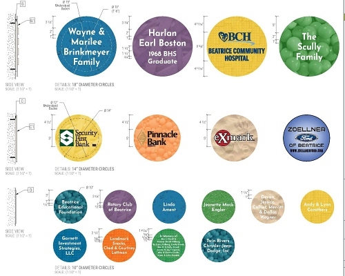
To establish depth in a three-dimensional space, the final bubble graphics were fabricated in varying diameters (18”, 14”, and 10”) and staggered material thicknesses. Detailed production drawings with drop shadows and multi-angle side views ensured precision during fabrication and installation. They also helped our team and the client better understand how a 2D drawing would look in the 3D world.
Solving the Complexities of Donor Name Typography & Future Scalability
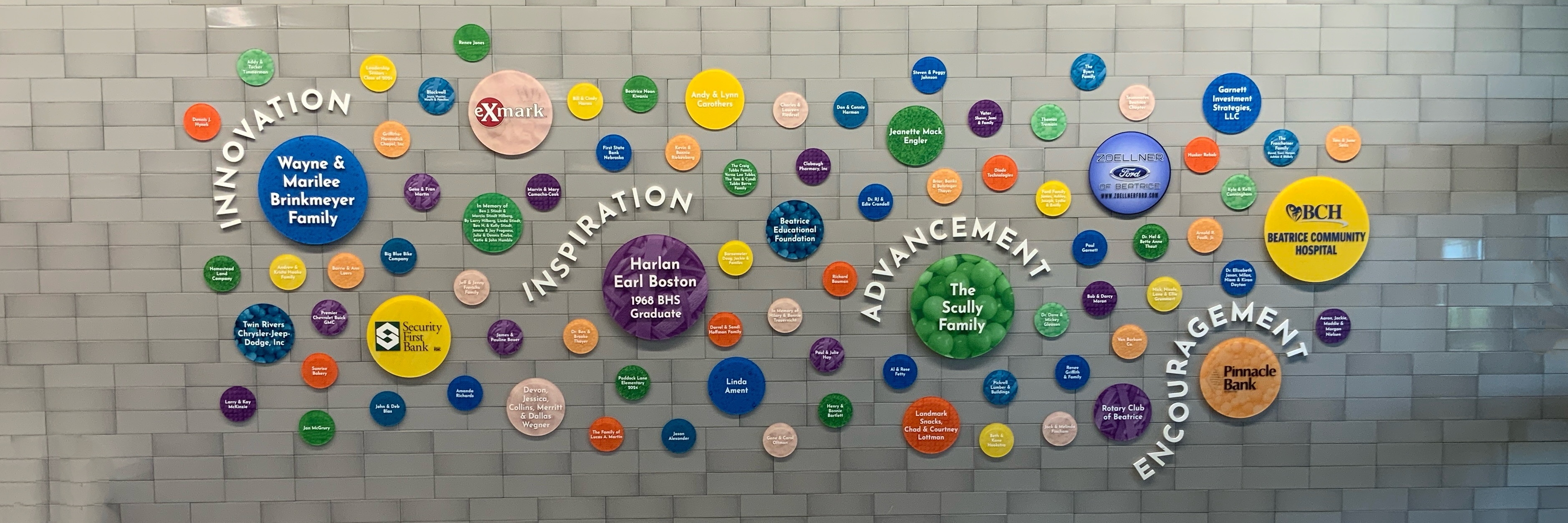
Names can be the trickiest part of a donor wall. A single font needs to fit all lengths of names in all sizes of circles. The client wanted to make sure the names popped out from the bubbles, because after all, the donor names are the entire point of a donor recognition wall. A simple sans serif font that felt kid-friendly and was clean and readable was the way to go.
During the design process, names can change, or a donor might move from a lower-tier donation to a higher tier. Designs are in constant flux until the physical display is manufactured. Clients often want to add donors to their displays as time goes on, and these dynamic donor walls can grow while maintaining conceptual integrity. Utilizing modular, detached components ensures a donor display is malleable and can handle future naming updates without a complete system overhaul.
With this particular design, we worked from the center of the display outward and left room for the display wall to grow. This strategy left deliberate, balanced negative space along the perimeter, allowing Beatrice Public Schools to mount additional donor bubbles as their capital campaigns expand over time.
Connect with our sign design and fabrication specialists at connect@latitudesignage.com.
Like what you see?
Get more ideas, design, and inspiration delivered to your inbox on a monthly basis. Sign up for our email, we won’t waste your time!